Competition | Visual Design
2025
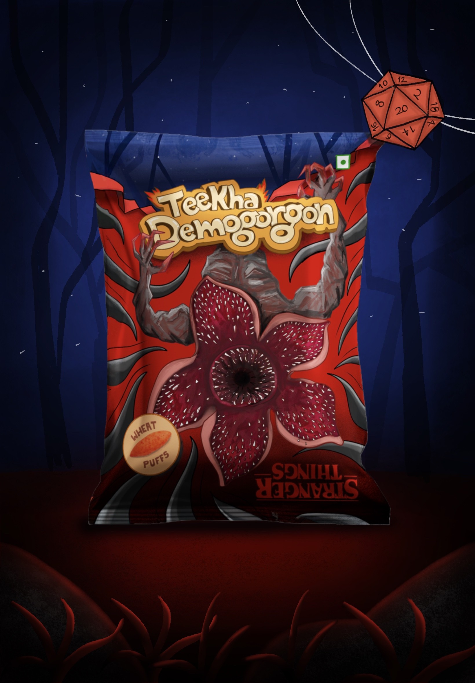
Teekha Demogorgon
Redesigning the complaint flow of the app for better efficiency of the problem solving.
The brief was to choose a snack and design its packaging inspired by a Stranger Things character. I had never watched the show, so the theme was new to me, and I started by learning its world. On the snack side, I picked one I grew up with and set out to make it impossible to ignore on a shelf.

Why Wheat Puffs
A childhood favourite, lost on the shelf
Wheat puffs are light, crunchy, and loved by many growing up. Today they’re overshadowed by Lays, Cheetos, and Balaji, whose packaging does the selling. The existing wheat puff packaging is plain and fails to grab attention, so the snack gets overlooked despite the nostalgia.

The Concept
Where the Demogorgon meets the crunch
I chose the upside-down Demogorgon as the main visual. It’s bold, strange, and makes people curious enough to pick the pack up. Keywords shaped every decision, like Upside Down, Portal, Spicy, Fire, Crunchy, Bold, Nostalgia. I left the logo out on purpose, because the goal here was visual impact on the shelf, not branding.

The Process
From rough sketches to the final pack
The design went through many small iterations, each one moving closer to the concept. Early sketches explored how the Demogorgon could sit on the pack, and each round refined the composition, colour, and balance between the creature and the snack.